Joseph is an artist living and working in Galloway, NJ. He draws and paints portraits, still lives, and occasionally teaches.
Jul 8, 2013
Worn Path VII
I have been painting some small landscapes lately, trying to get into a groove of finishing a painting in very short periods of time. I'm going to post about 25-30 of them almost daily in the next few weeks. I apologize in advance for photobombing my followers of this blog with all of these images.
I wanted these landscapes to reflect the time just before dusk where the sun is low on the horizon and the sky appears vibrantly blue. I intentionally aimed to make the land appear a bit darker to create a strong light brilliant light coming from the sky. In fact if you look at the sky around this time of day the trees and grass around you would appear almost black, because your eyes adjust to the light of the sky. This painting lightens that effect slightly to keep the ground visible for the viewer.
These small landscapes were all done with a limited palette of six colors. Here is a list of the colors used: titanium white, cadmium yellow, yellow ochre, venetian red, ultramarine blue, and ivory black.
If you're interested in purchasing this painting please visit DailyPaintworks at this link: http://www.dailypaintworks.com/fineart/joseph-pfeifferherbert/worn-path-vii/151322
Jul 5, 2013
Worn Path VI
I have been painting some small landscapes lately, trying to get into a groove of finishing a painting in very short periods of time. I'm going to post about 25-30 of them almost daily in the next few weeks. I apologize in advance for photobombing my followers of this blog with all of these images.
I wanted these landscapes to reflect the time just before dusk where the sun is low on the horizon and the sky appears vibrantly blue. I intentionally aimed to make the land appear a bit darker to create a strong light brilliant light coming from the sky. In fact if you look at the sky around this time of day the trees and grass around you would appear almost black, because your eyes adjust to the light of the sky. This painting lightens that effect slightly to keep the ground visible for the viewer.
These small landscapes were all done with a limited palette of six colors. Here is a list of the colors used: titanium white, cadmium yellow, yellow ochre, venetian red, ultramarine blue, and ivory black.
If you're interested in purchasing this painting please visit DailyPaintworks at this link: http://www.dailypaintworks.com/fineart/joseph-pfeifferherbert/worn-path-vi/151320
Jul 4, 2013
Worn Path V
I have been painting some small landscapes lately, trying to get into a groove of finishing a painting in very short periods of time. I'm going to post about 25-30 of them almost daily in the next few weeks. I apologize in advance for photobombing my followers of this blog with all of these images.
I wanted these landscapes to reflect the time just before dusk where the sun is low on the horizon and the sky appears vibrantly blue. I intentionally aimed to make the land appear a bit darker to create a strong light brilliant light coming from the sky. In fact if you look at the sky around this time of day the trees and grass around you would appear almost black, because your eyes adjust to the light of the sky. This painting lightens that effect slightly to keep the ground visible for the viewer.
These small landscapes were all done with a limited palette of six colors. Here is a list of the colors used: titanium white, cadmium yellow, yellow ochre, venetian red, ultramarine blue, and ivory black.
If you're interested in purchasing this painting please visit DailyPaintworks at this link: http://www.dailypaintworks.com/fineart/joseph-pfeifferherbert/worn-path-v/151318
Jul 3, 2013
Worn Path IV
I have been painting some small landscapes lately, trying to get into a groove of finishing a painting in very short periods of time. I'm going to post about 25-30 of them almost daily in the next few weeks. I apologize in advance for photobombing my followers of this blog with all of these images.
I wanted these landscapes to reflect the time just before dusk where the sun is low on the horizon and the sky appears vibrantly blue. I intentionally aimed to make the land appear a bit darker to create a strong light brilliant light coming from the sky. In fact if you look at the sky around this time of day the trees and grass around you would appear almost black, because your eyes adjust to the light of the sky. This painting lightens that effect slightly to keep the ground visible for the viewer.
These small landscapes were all done with a limited palette of six colors. Here is a list of the colors used: titanium white, cadmium yellow, yellow ochre, venetian red, ultramarine blue, and ivory black.
If you're interested in purchasing this painting please visit DailyPaintworks at this link: http://www.dailypaintworks.com/fineart/joseph-pfeifferherbert/worn-path-iv/151321
Jul 2, 2013
Worn Path II
I have been painting some small landscapes lately, trying to get into a groove of finishing a painting in very short periods of time. I'm going to post about 25-30 of them almost daily in the next few weeks. I apologize in advance for photobombing my followers of this blog with all of these images.
I wanted these landscapes to reflect the time just before dusk where the sun is low on the horizon and the sky appears vibrantly blue. I intentionally aimed to make the land appear a bit darker to create a strong light brilliant light coming from the sky. In fact if you look at the sky around this time of day the trees and grass around you would appear almost black, because your eyes adjust to the light of the sky. This painting lightens that effect slightly to keep the ground visible for the viewer.
These small landscapes were all done with a limited palette of six colors. Here is a list of the colors used: titanium white, cadmium yellow, yellow ochre, venetian red, ultramarine blue, and ivory black.
If you're interested in purchasing this painting please visit DailyPaintworks at this link: http://www.dailypaintworks.com/fineart/joseph-pfeifferherbert/worn-path-ii/151319
Jul 1, 2013
Worn Path I
I have been painting some small landscapes lately, trying to get into a groove of finishing a painting in very short periods of time. I'm going to post about 25-30 of them almost daily in the next few weeks. I apologize in advance for photobombing my followers of this blog with all of these images.
I wanted these landscapes to reflect the time just before dusk where the sun is low on the horizon and the sky appears vibrantly blue. I intentionally aimed to make the land appear a bit darker to create a strong light brilliant light coming from the sky. In fact if you look at the sky around this time of day the trees and grass around you would appear almost black, because your eyes adjust to the light of the sky. This painting lightens that effect slightly to keep the ground visible for the viewer.
These small landscapes were all done with a limited palette of six colors. Here is a list of the colors used: titanium white, cadmium yellow, yellow ochre, venetian red, ultramarine blue, and ivory black.
If you're interested in purchasing this painting please visit DailyPaintworks at this link: http://www.dailypaintworks.com/fineart/joseph-pfeifferherbert/worn-path-i/151317
Jun 8, 2013
Portrait of Charlie III
This is a little portrait I did of one of my son's friends. I tried to finish it in a record amount of time 4-6 hours during my son's naptimes. It actually took about 12 or more hours to complete.
Charlie III
Oil on Panel
8" x 10"
The following colors were used to complete this portrait: Titanium White, Yellow Ocher, Venetian Red, and Ivory Black
Jun 7, 2013
Iron Lime
Here is another in the same vein as the Iron Apple painting. This time with a lime and I didn't have to exaggerate the size of the fruit in the pan to make for a better composition in this painting. (unlike Iron Apple where I made the skillet look tiny compared to the apple.)
Iron Lime
Oil on Panel
10" x 8"
Jun 6, 2013
Portrait of Dennis
Here is a (mostly) finished version of a painting of my father. There is one thing missing from this painting that makes it look a little awkward once you notice it. See if you can guess correctly in the comments.
I used the following colors on this portrait: Titanium White, Yellow Ocher, Venetian Red, Ultramarine Blue, Alizarin Crimson, and Ivory Black.
Portrait of Dennis
Oil on Panel
10" x 8"
I used the following colors on this portrait: Titanium White, Yellow Ocher, Venetian Red, Ultramarine Blue, Alizarin Crimson, and Ivory Black.
Jun 5, 2013
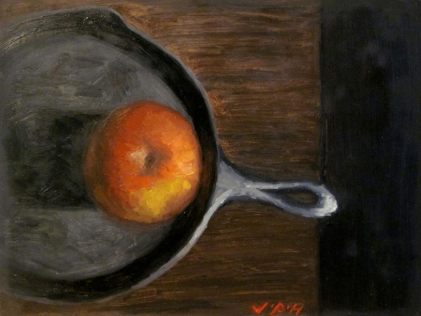
Iron Apple
Here is a simple composition I made using walnut oil as my medium. I like the walnut oil better than linseed oil it felt like the paint flowed smoother without being too slippery and provided good coverage across the panel.
I had to enlarge the size of the apple to make it a greater focus in the painting, consequently it makes the skillet look very small.
Iron Apple
Oil on Panel
6" x 8"
Subscribe to:
Posts (Atom)